The Opportunity
The Tourist Corridor between Cabo San Lucas and San Jose del Cabo is one of the most competitive luxury real estate markets in the Western Hemisphere. Montage. Rosewood's Las Ventanas. One&Only; Palmilla. The Four Seasons at Costa Palmas. Zadun, a Ritz-Carlton Reserve. This is the neighborhood.
Be more unique and indigenous in look, feel, and tone of voice.
The brief was explicit: don't imitate the aesthetic of the surrounding properties. Be more unique and indigenous in look, feel, and tone of voice. That's where Us Agency came in.
Strategic Foundation
Before any design work started, the brand needed a position. Not just a look. A reason to believe.
Cabo Real Surf Club isn't for everyone in Cabo. It’s for a specific kind of buyer: active families who collect experiences, not just assets. Next-generation buyers looking for a next-generation club. Surf-focused and surf-curious people who have the means and the motivation. These people are not shopping for another version of what already exists in Los Cabos. They're looking for something that reflects how they actually live: fluid, active, culturally engaged, unapologetically in pursuit of a great day.
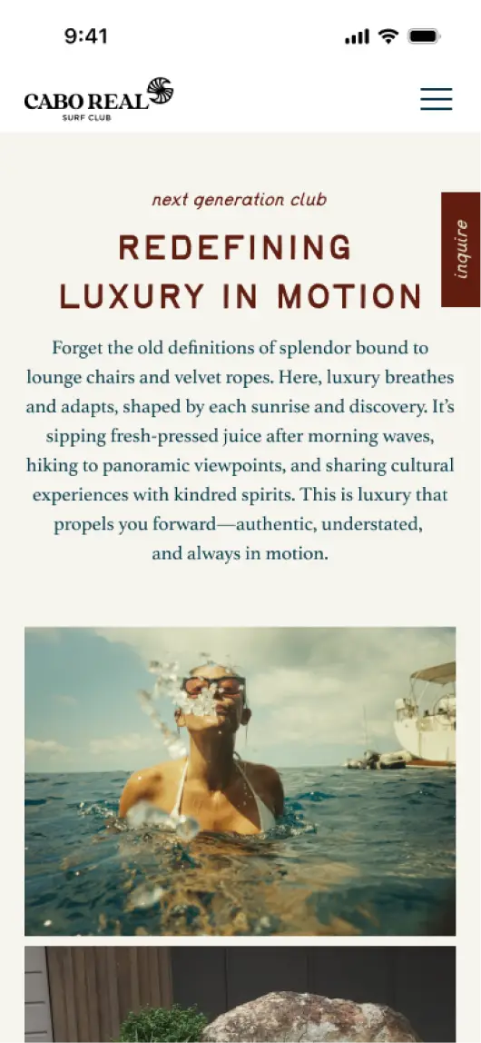
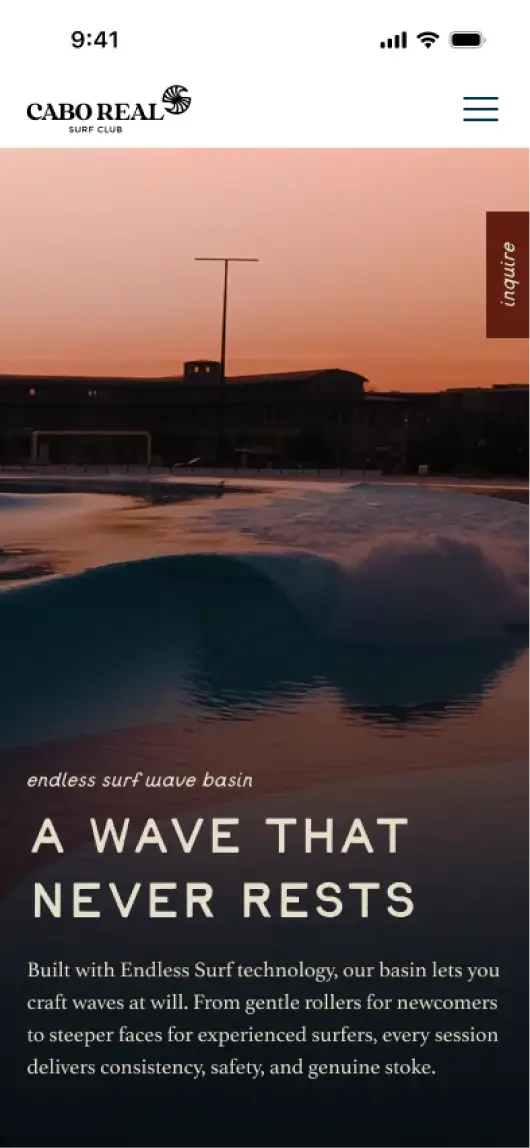
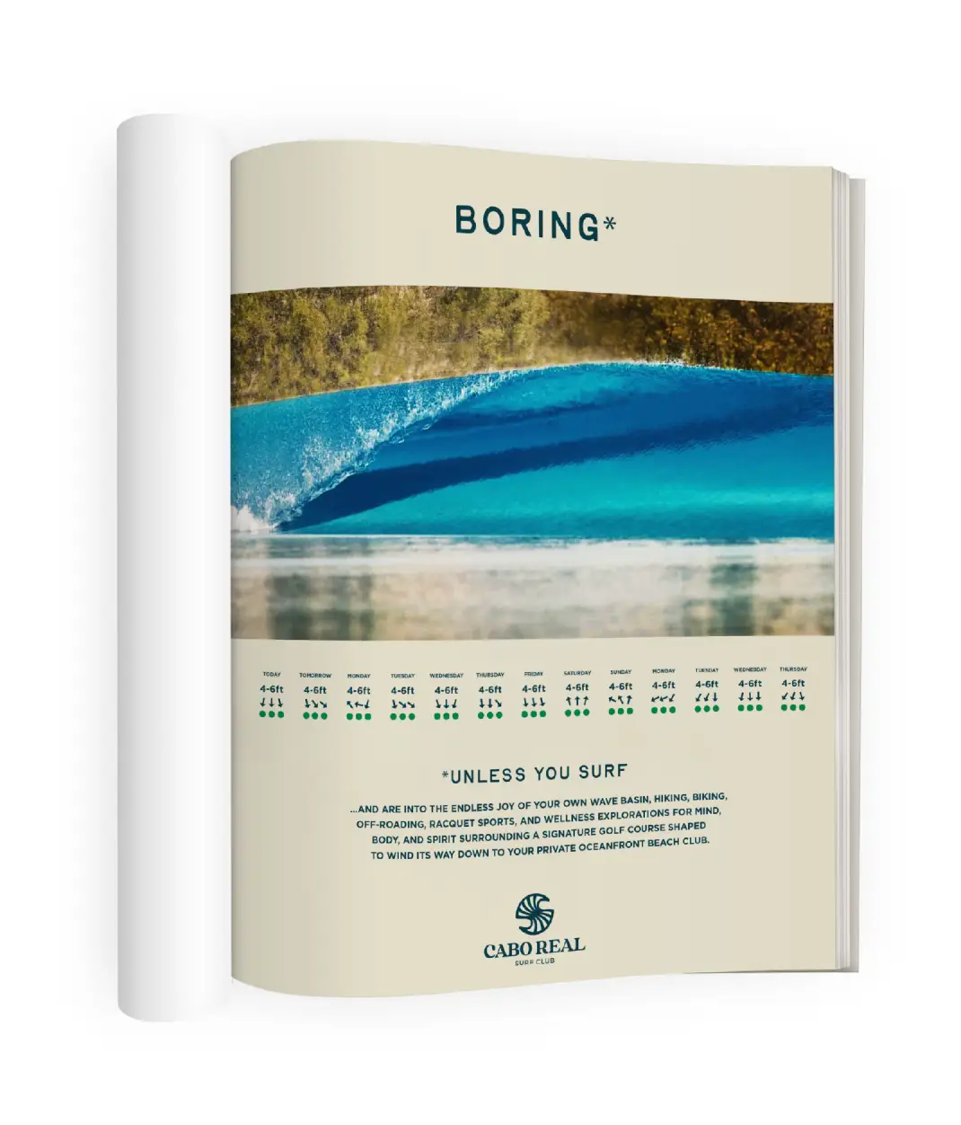
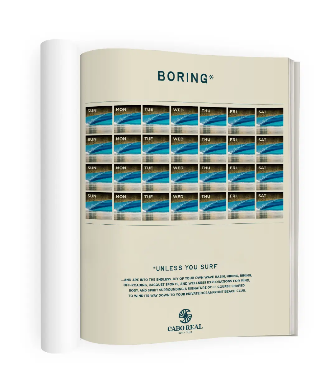
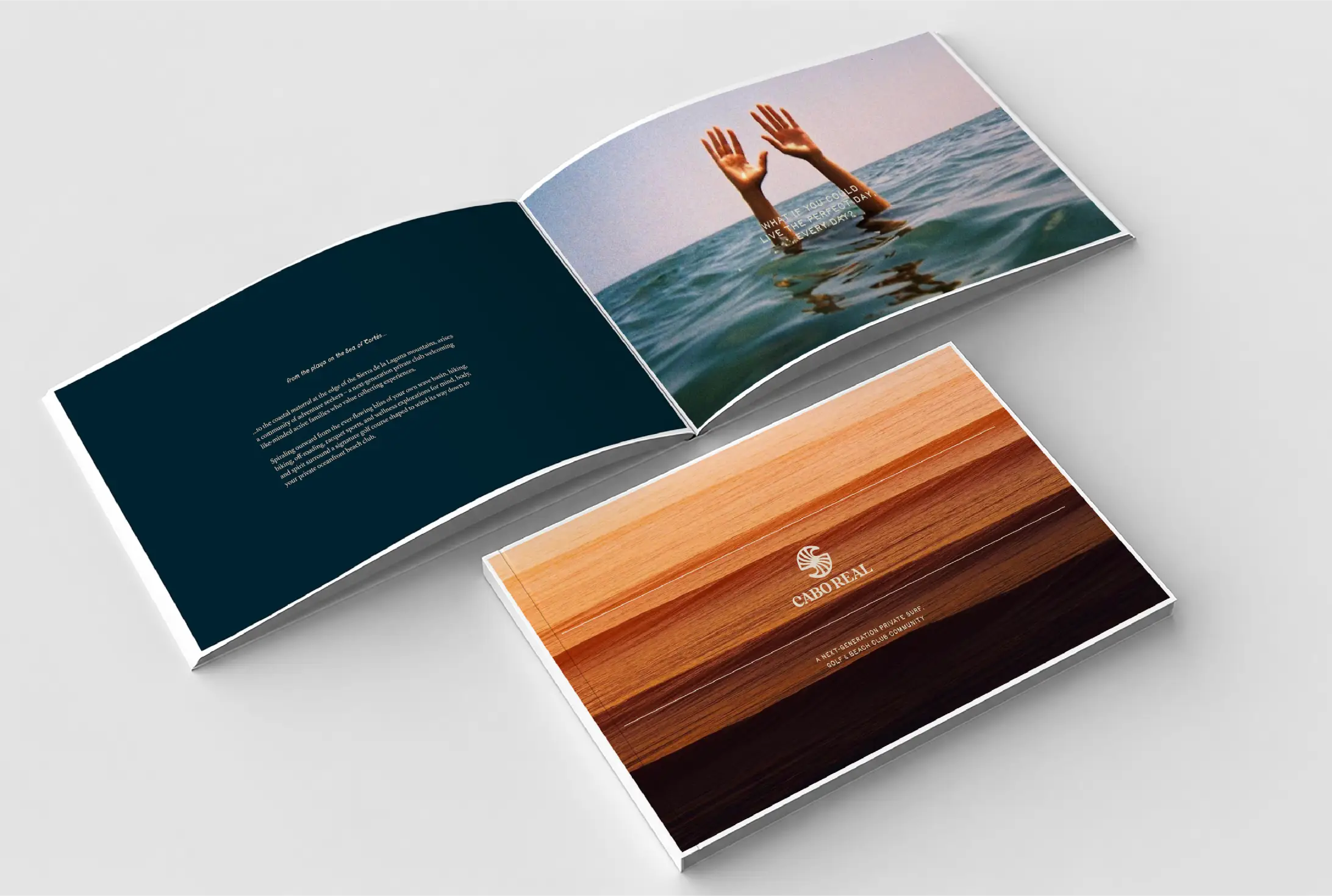
The brand concept we built: Cada Dia. Every day. The idea: what if you could live the perfect day, every day? Not a static fantasy. Not a vacation you return from. A real life designed around surf, golf, family, food, discovery, and rest. A place that's endlessly good without ever getting boring. The brand essence: Cascading waves of fulfillment.
[.screen-grid.full]
[video=https://v.kley.co/videos/us/cabo-strategic-01_processed.mp4 transcripts=0]
[/.screen-grid.full]
[.screen-grid.full]
[video=https://v.kley.co/videos/us/cabo-strategic-02_processed.mp4 transcripts=0]
[/.screen-grid.full]
[.screen-grid.full]
[/.screen-grid.full]
[.screen-grid]
[/.screen-grid]
The Identity System
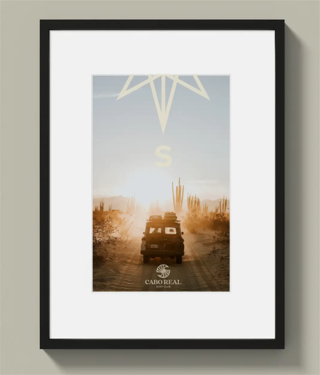
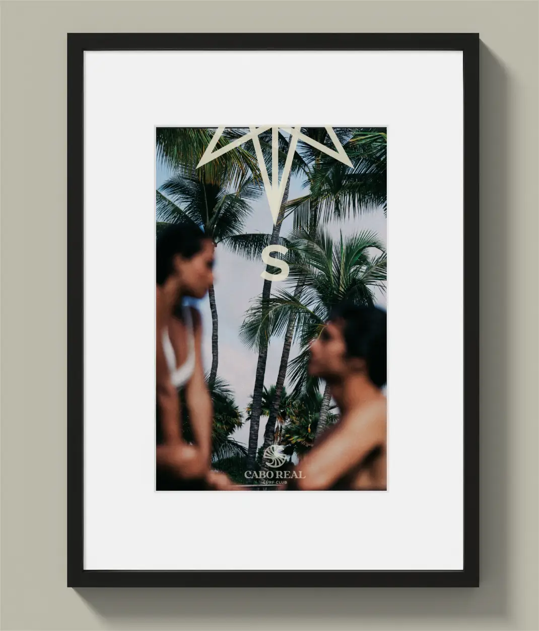
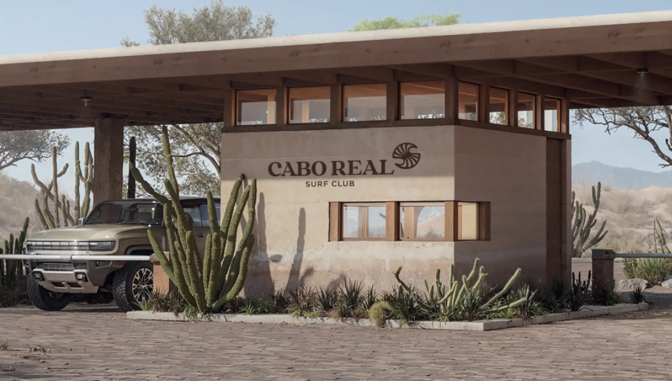
The visual direction was set deliberately against the expected aesthetic of luxury Cabo real estate. No over-polished coastal minimalism. No resort-generic sans-serifs and neutral palettes. Cabo Real Surf Club was designed to feel specific to the region, blending contemporary Mexican art and architecture with the visual language of authentic surf culture.
Like it came from the water, not from a design software grid.
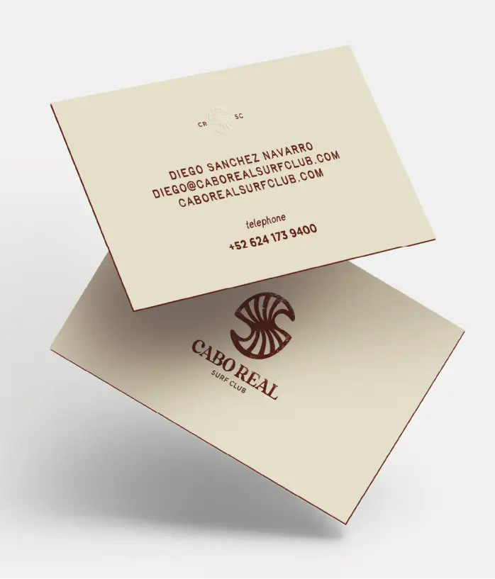
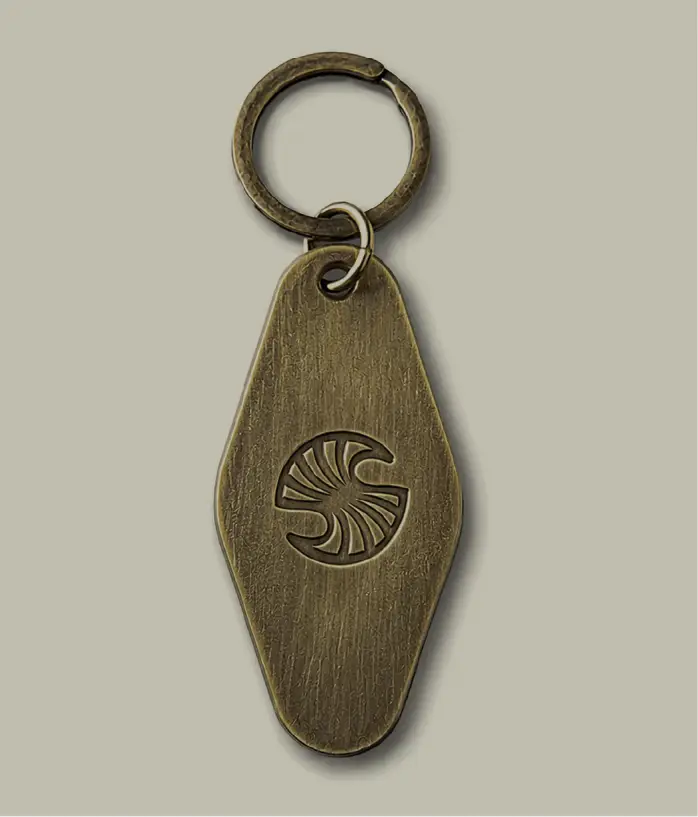
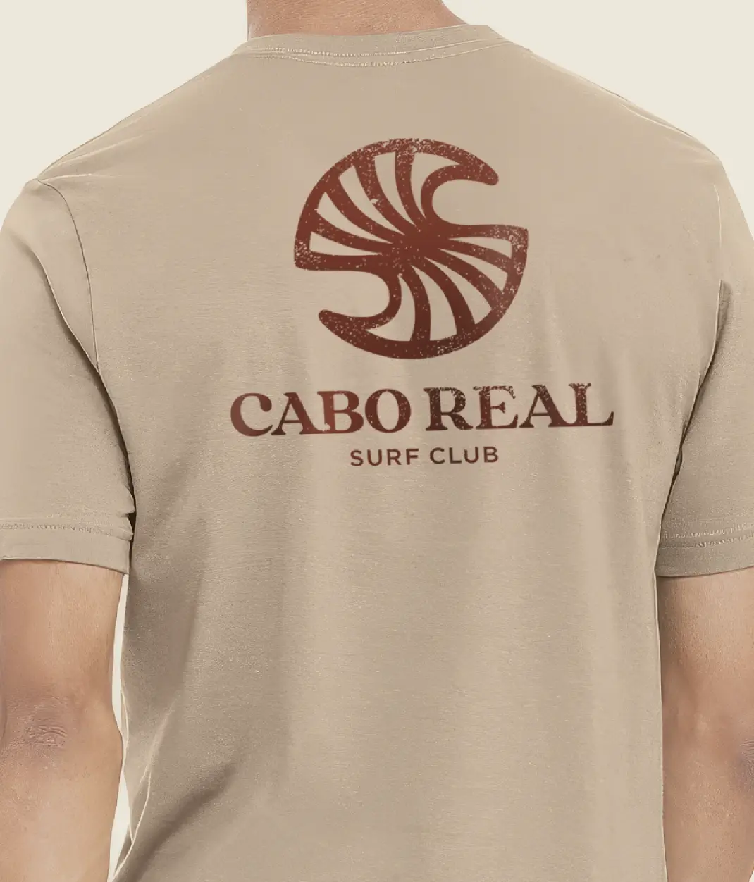
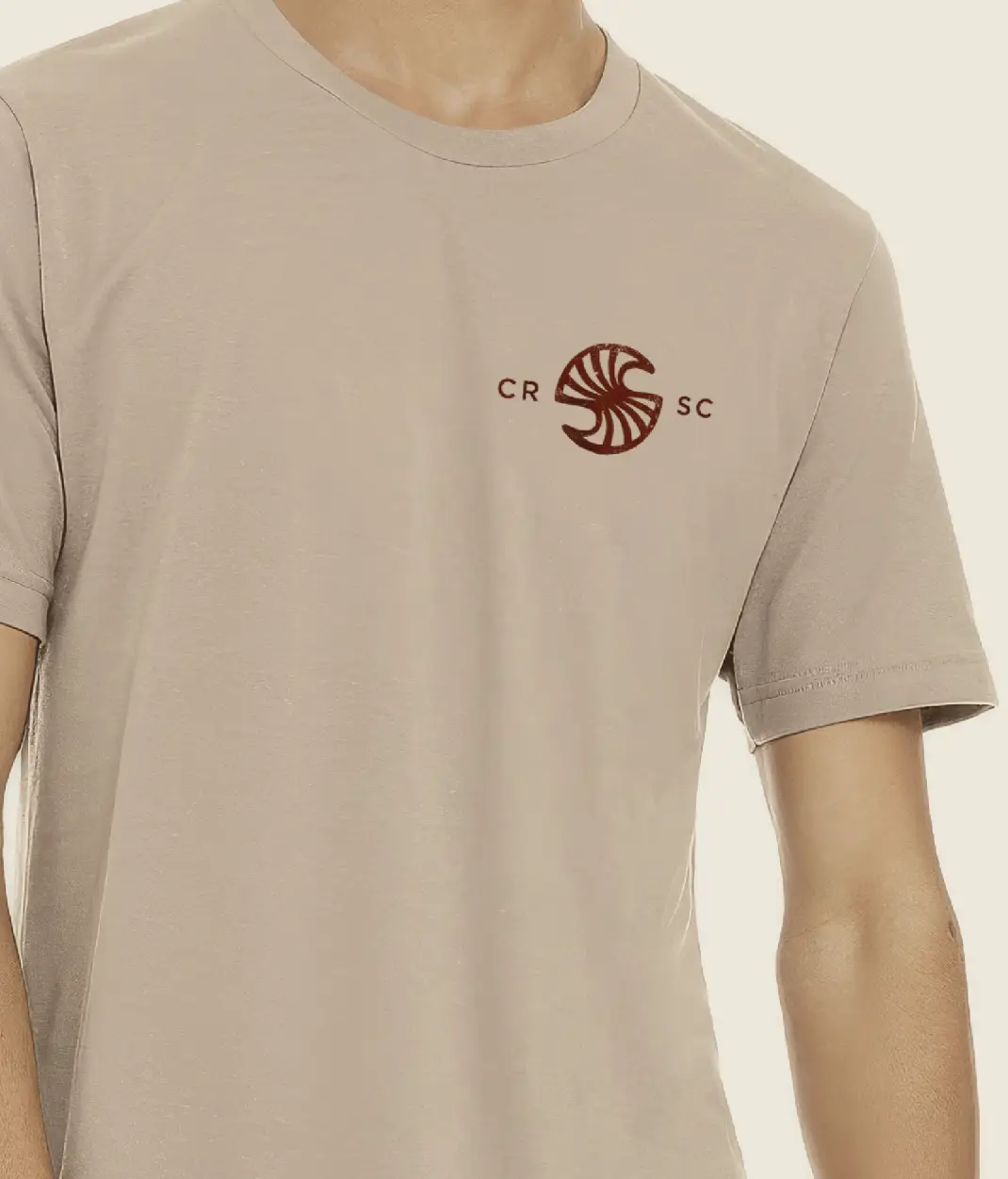
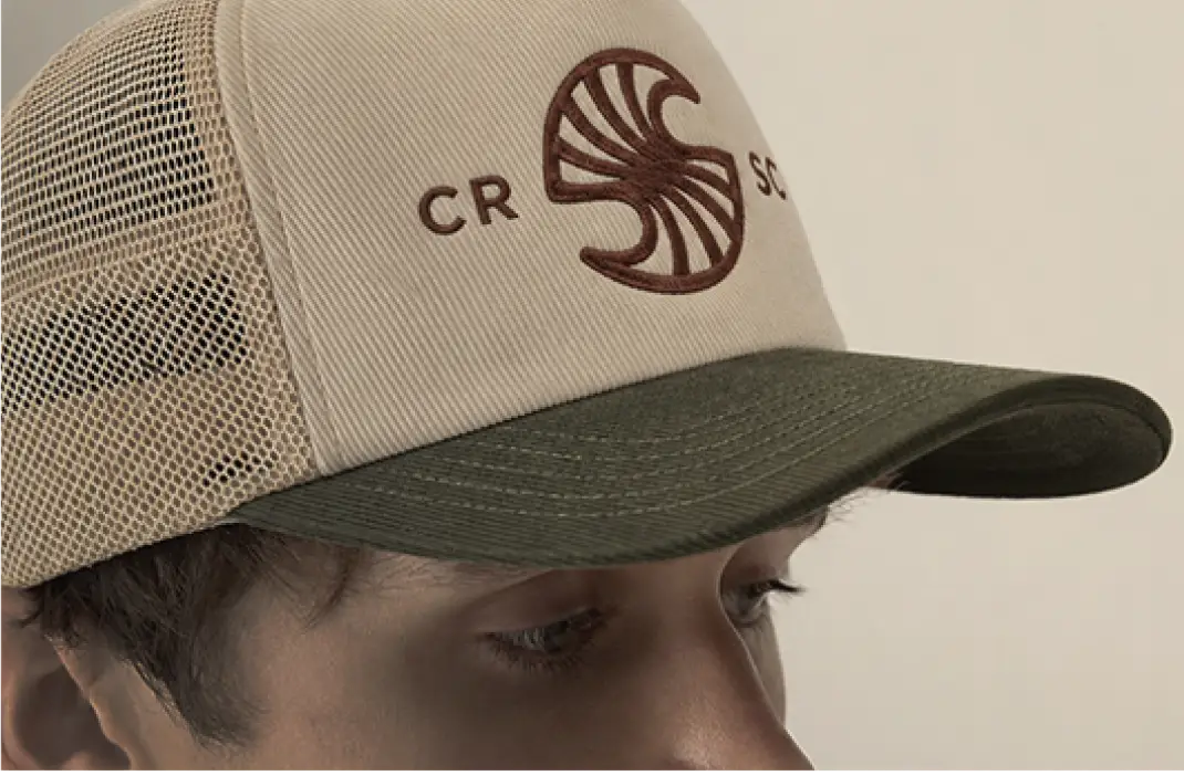
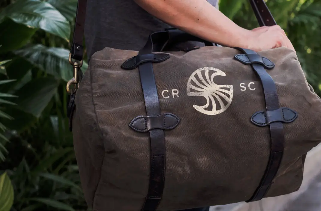
The trademark is an asymmetrical, organic wave form. Intentionally imperfect in the way a real wave is imperfect. Every tooth-like insert within the mark is unique. No two are alike. Designing asymmetry into a logo rather than away from it is rare. The mark feels handmade in the best sense. Like it came from the water, not from a design software grid.
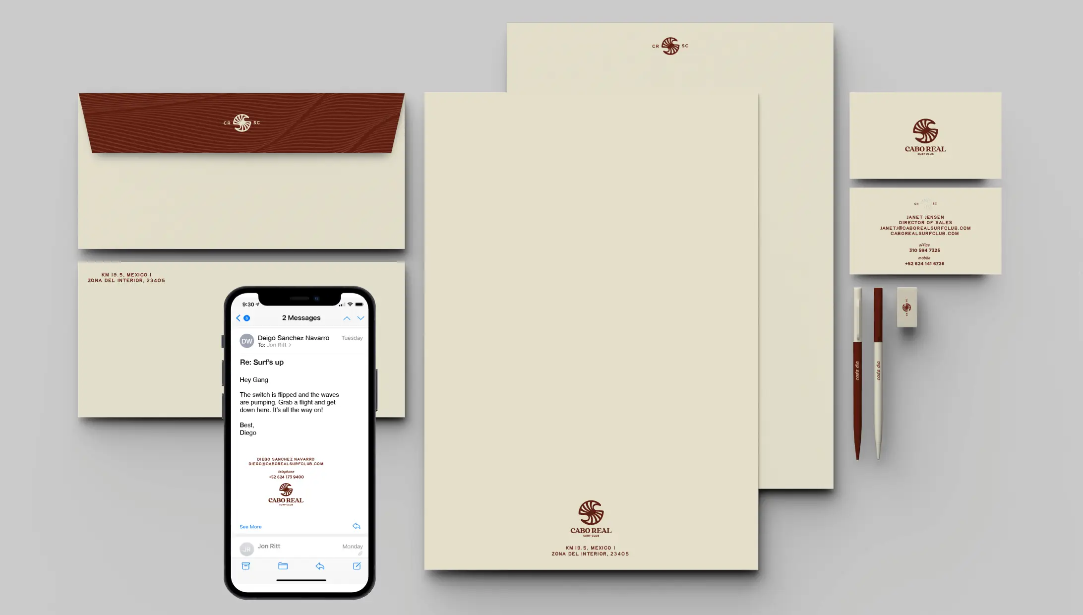
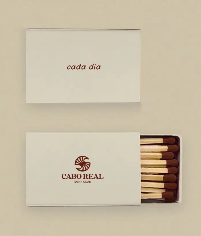
The primary palette was built from the landscape: Serrano Pepper red (#601D10) as the hero color, Parchment (#E4DFCA) as the secondary, Teal (#6CA7AD) for the Sea of Cortes, and Deep Navy (#043846) for depth. Typography followed the same logic: Tay Birdie headlines with personality, Athelas handling body copy with precision. A custom wave pattern rounds out the system, flexible enough to work as a background, texture, or primary graphic, and consistent enough to build immediate recognition.
[.grid-3]
[/.grid-3]
[.grid-2]
[/.grid-2]
The Voice
The brand voice was built around a fictional character named Alán: a Cabo native, waterman, polyglot, world traveler, and unofficial cultural ambassador of the club. Born in San Jose del Cabo. Surfed with world-class pros. Studied design and architecture in Mexico City. Speaks Spanish, English, and French.
The idea was to write like Alán talks. Warm, genuine, knowledgeable without being showy. Fluent in surf culture without being exclusionary. The kind of voice that makes you feel like you belong before you've even arrived.
[.grid-2]
[/.grid-2]
The Surf Casitas
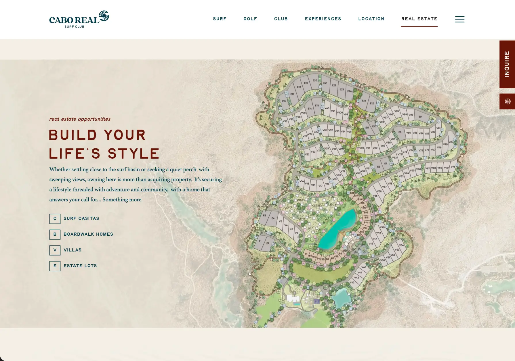
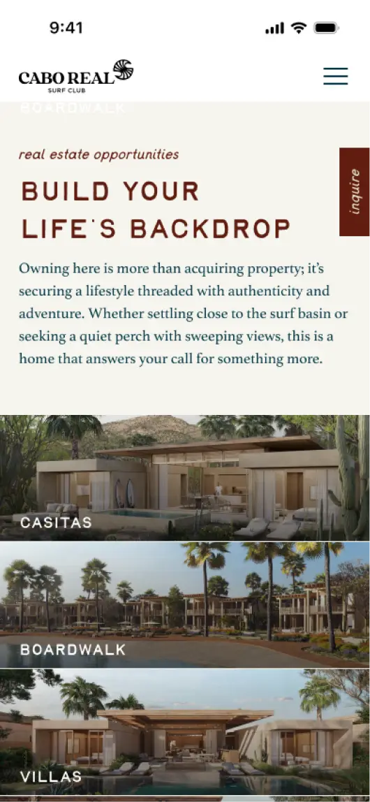
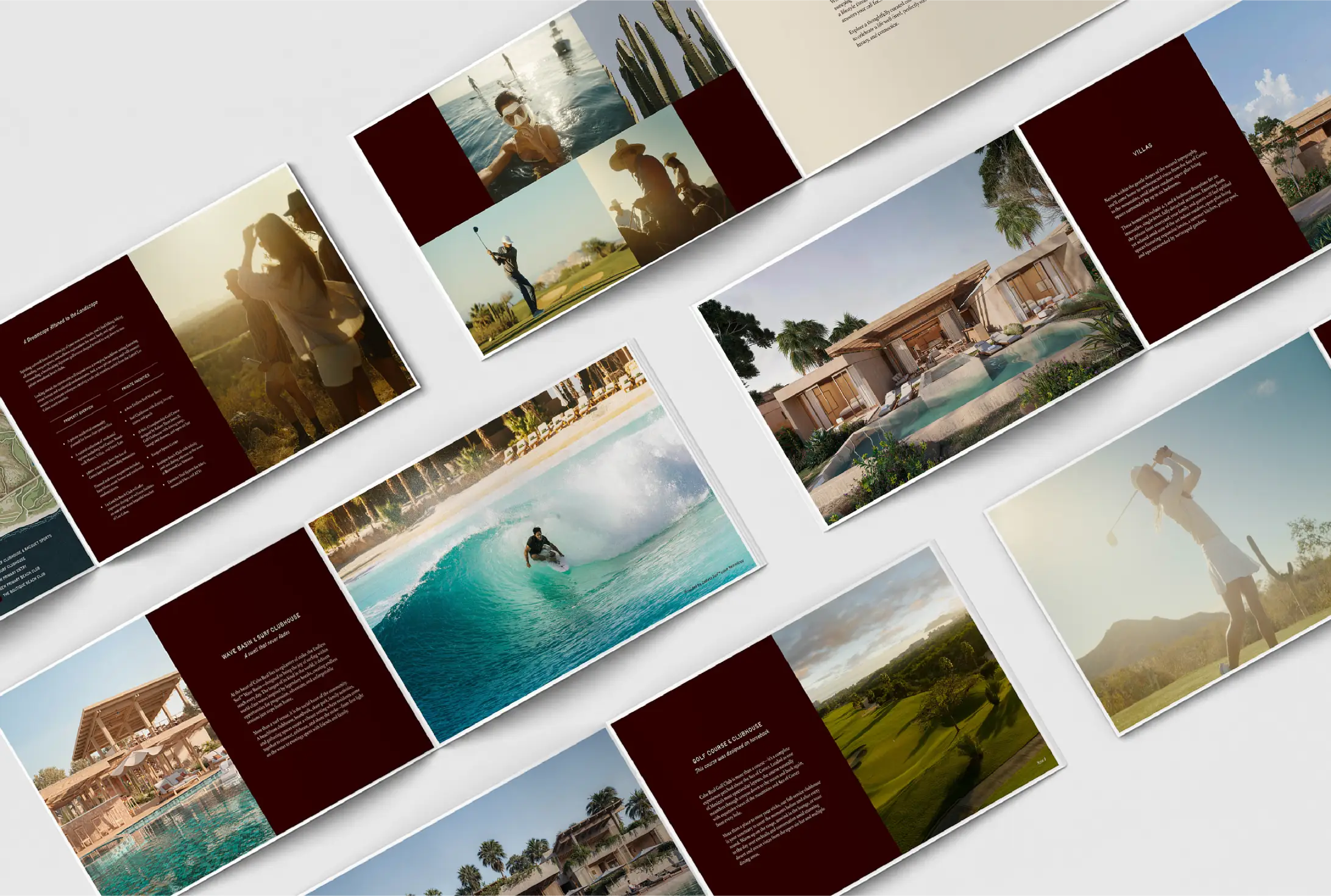
One of the key sales products Us Agency supported was the Surf Casitas: a collection of 31 three-bedroom, single-level homes designed by Mexico City's preeminent contemporary architects. Each casita features indoor-outdoor living illuminated by clerestory windows, a great room, media room, dual primary suites, private patio, plunge pool, and xeriscaped garden. Interior: 2,246 square feet. Exterior: 3,354 square feet.
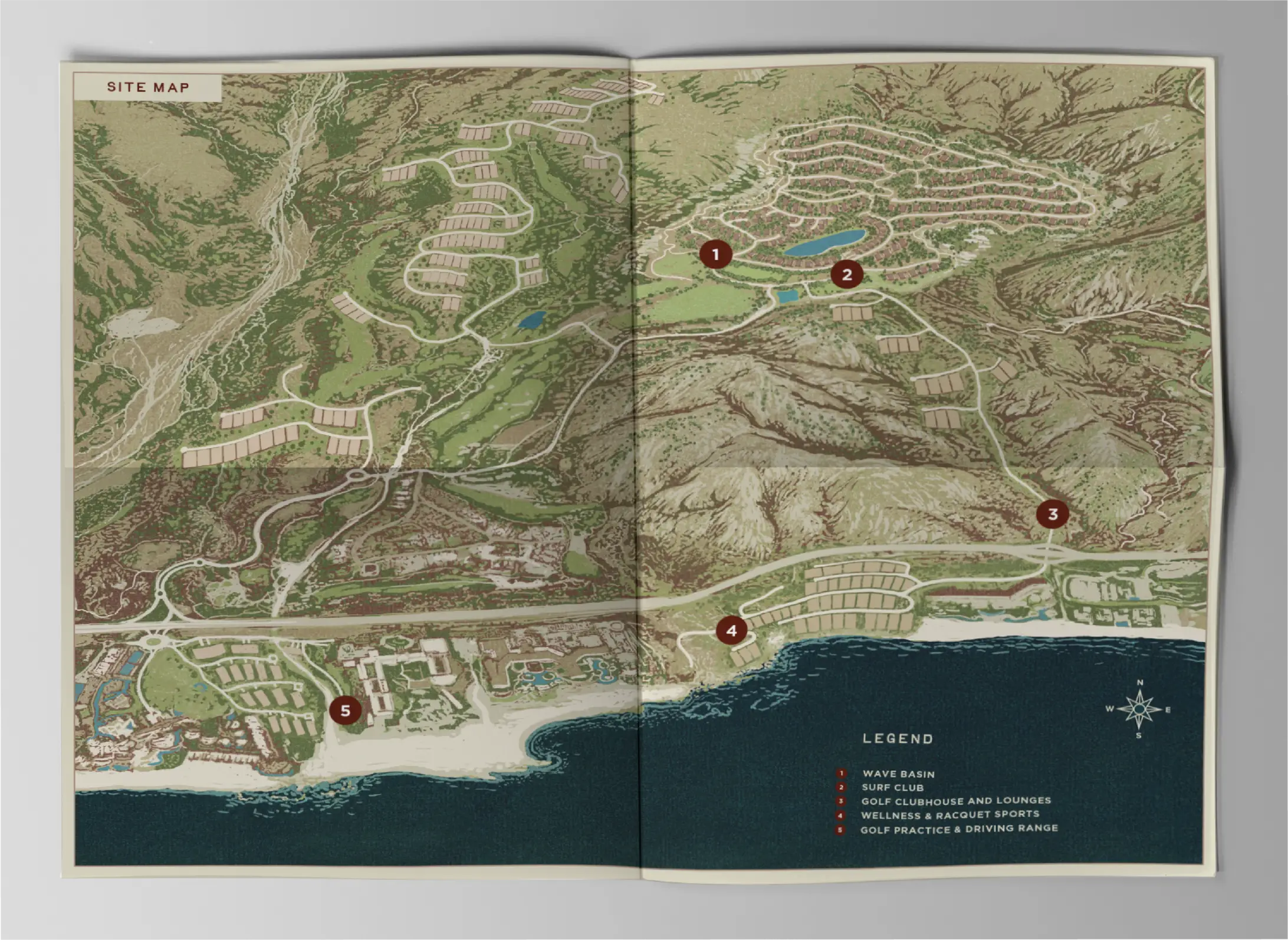
Located in clusters connected by pedestrian pathways through natural landscape, all oriented toward the wave basin at the community's center. The collateral that brought this product to life needed to do two jobs: communicate the architectural quality precisely, and make the buyer feel the lifestyle viscerally. The lot maps, sales materials, and marketing assets Us Agency produced did both.
[.grid-2]
[/.grid-2]
The Results
250 lots sold in record time. In a market surrounded by some of the most established luxury residential brands in the world, Cabo Real Surf Club sold its first 250 lots faster than comparable properties in the corridor.
The brand earned that. When buyers are choosing between communities with decades of brand equity and a newcomer, the newcomer's identity has to do serious work. It has to signal credibility, communicate differentiation, and create desire simultaneously. The Cada Dia platform, the indigenous visual identity, and the full suite of collateral and marketing materials gave the sales team tools that could genuinely compete.
Residences will be ready for occupancy in 2027. The wave basin opens in Winter 2026, powered by Endless Surf technology delivering hundreds of customizable waves per hour, with over 40 wave profiles adjustable for height, speed, and angle.